top of page

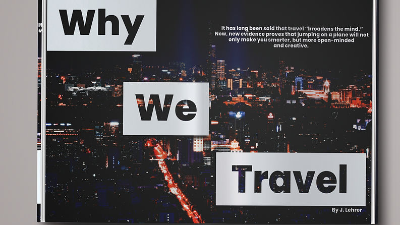
Why We Travel
This project focused on designing a magazine spread for the article “Why We Travel,” with an emphasis on clarity and visual appeal. The goal was to create a layout that felt engaging while remaining easy to read. Using a modernist approach, I incorporated a structured grid system and clean sans serif typography. The final result is a balanced, visually refined spread that supports the narrative of the article while delivering a smooth and
enjoyable reading experience.


bottom of page